http://prezi.com/vzajjflmwfls/photography-in-magazines/
Prezi Link above.
Monday, 30 December 2013
Friday, 6 December 2013
Draft photos and ideas
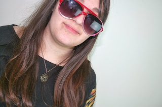
This is the image I'm choosing to use fro the front cover of the magazine, this is because of the posing and
Thursday, 5 December 2013
Test shots
two shot- this photo is of medium view and shows two people hence the name it allows for a image to show two different aspects but in the same photo in this one; gender.
Bad framing- this has bad framing because it has to much above and not her feet so it is framed badly.
Group shot- The next two images are group shots they show a group and this allows for a image to have multiple focus points but this one has bad framing
" better framing
Mid shot/medium close up- this shot is good because it shows a good half of the body and allows for a nice view of the persons emotions.
close up- this is the closest shot to the face to show the emotion that is shown on the model's face


this is another example of bad framing but close up
Pose shot- A pose shot is used to show off a a pose and to make a person look a specific way, for example this image is the way she hands point towards her face.
more group shot's
Bad framing- this has bad framing because it has to much above and not her feet so it is framed badly.
Group shot- The next two images are group shots they show a group and this allows for a image to have multiple focus points but this one has bad framing
" better framing
Mid shot/medium close up- this shot is good because it shows a good half of the body and allows for a nice view of the persons emotions.
close up- this is the closest shot to the face to show the emotion that is shown on the model's face


this is another example of bad framing but close up
Pose shot- A pose shot is used to show off a a pose and to make a person look a specific way, for example this image is the way she hands point towards her face.
more group shot's
Thursday, 28 November 2013
Thursday, 21 November 2013
Magazine artist looks.
This look is casual and smart so it looks good yet it fits with the sort of flaunting of you taste in music thing that goes on.
This look is much more of a sort of "Mod" style however you see a lot of the artist that play to my genre wearing the same sort of things.
Thursday, 14 November 2013
Thursday, 7 November 2013
Name, genre and font.
The genre of my choice.
The genre i will be choosing for definite will be "Indie rock".
So my magazine will be focused on bands/artist's such as The smiths, The who, Arctic Monkeys and many others.
I have decided upon this genre because i enjoy the style of music and i feel that i will be able to draw a lot of inspiration from existing magazines, such as "NME".
The Name and Font
For the name of my magazine i have chosen to think of something simple yet easy to remember, that is also relatable to genre so i have chosen " Rockin' ". The only problem i could think of was that it may be compared to a Rock music magazine. The Font i have chosen will be "papyrus" from "Adobe Photoshop CS5" this is because it feels slightly artistic yet rocky at the same time, which is a feel i get from a lot of Indie rock music. (sample displayed below.)
Wednesday, 6 November 2013
Subscribe to:
Comments (Atom)


